
Here I am. Back home. Back to where it all started. Android. I left for a few years in 2021 as Android phones, especially from Samsung, were becoming stale and I was tired of the infrequent and late updates. Hardware hadn’t made any significant or interesting jumps. Add more lenses to the camera, slowly inch the screen larger and closer to 7”, add rounded edges, take them away, increase screen resolution, refresh rate, etc. Nothing at all interesting. That is, until foldable phones started coming out. I left those alone for a few generations, as I knew they needed to be perfected and tweaked. There were a lot of things that needed to be fixed, both physically and in software. We are on the 4th generation of foldable phones, and I feel like most of the smaller issues have been resolved. So, for someone who has been with Android since the original Motorola Droid, here’s my take.

My last Android and Samsung phone was the Note 20 Ultra. The last Note phone. It was fine. It was not impressive, and it had pretty much been the same for the last five years. It was nice that Samsung was redesigning their entire UI system for all of their smart devices. Tablets, watches, and phones. We are on One UI 6.1 now, and I feel it’s mostly unchanged from what it was five years ago. I also last used Android 10, so there have been four Android system upgrades since my last use.
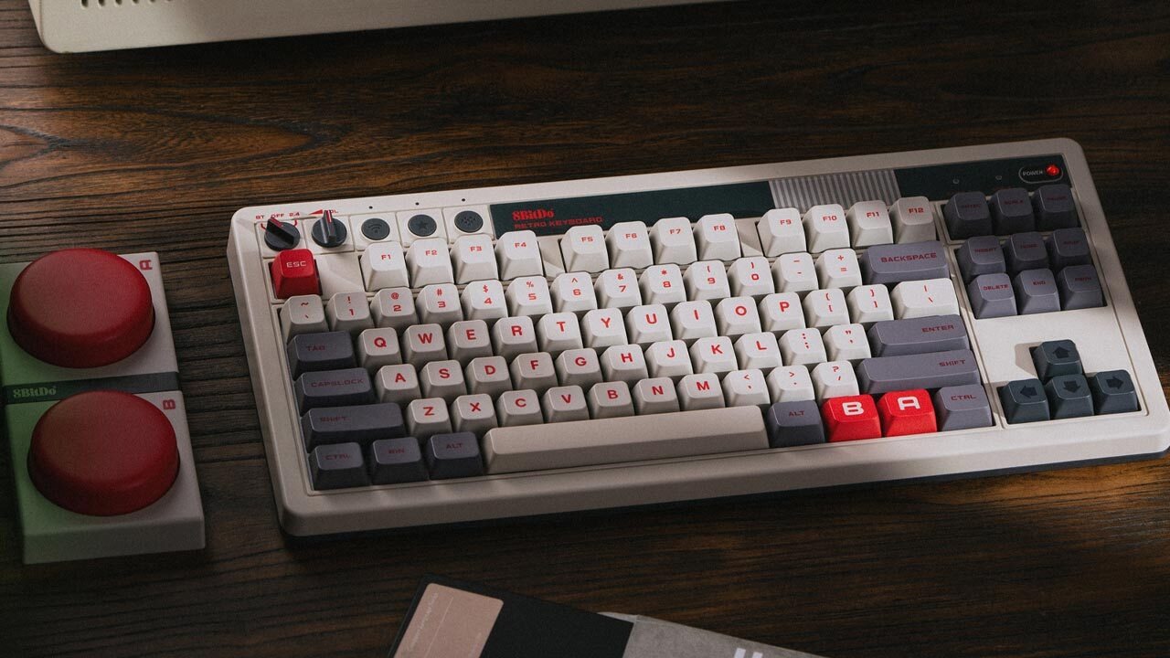
Unboxing experiences are mostly unremarkable these days. Phones no longer come with wall adapters and expect users to know what the proper wattage input is needed to properly fast charge their phone. The Flip 5 needs 25W and uses 15W for wireless charging. It comes with a USB-C cable, and that’s about it. The biggest thing to note is the phone when it’s folded in half. Usually, this would make you cringe. Folding phones in half is usually a big no-no these days, but this is by design. Samsung is using Corning Gorilla Victus 2 glass for the front and rear displays. There is also a hinge system in place for folding the phone. The “crease” in the phone is obvious at first, but when using the phone, I rarely notice it or forget about it quickly. The glass does have a different feel to it. It almost feels like a layer of plastic rather than solid glass, but it’s still smooth to the touch. The front screen is a 6.7-inch AMOLED 2x screen, while the rear display is a 3.4-inch Super AMOLED screen. Both are incredibly vivid and bright, and they look fantastic.
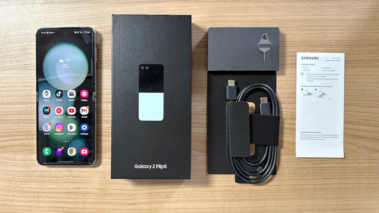
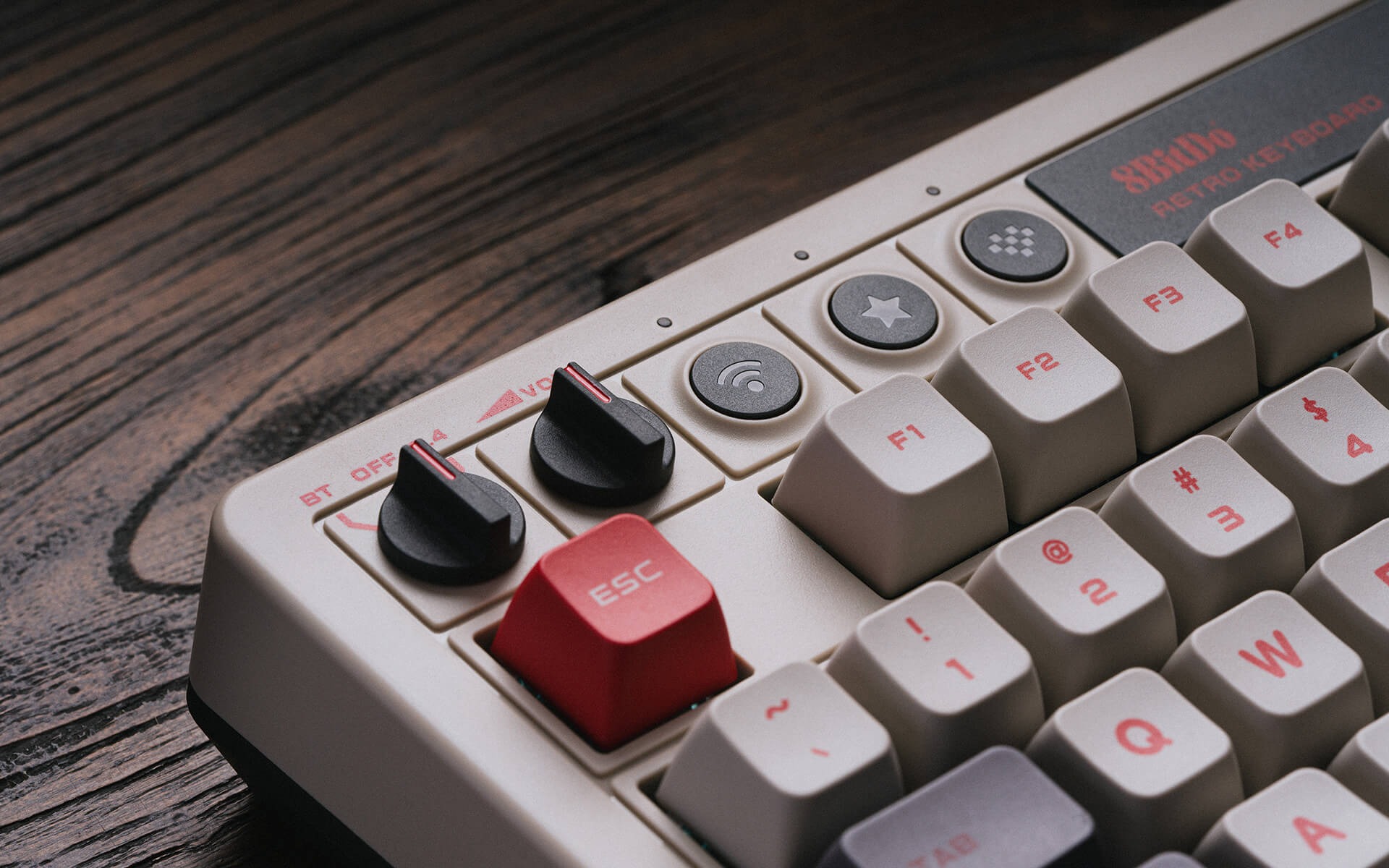
The rest of the phone also feels good on the hands. The fingerprint sensor is on the power button now, and this is needed so you can unlock your phone while it is folded and with one hand. It makes it easy to just press the power button, and your phone will unlock at the same time. No silly in-screen sensor, rear sensor, or any other place. I’ve used them all, and the power button makes the most sense. The only other button is a volume rocker. The screen features a keyhole front-facing camera that is super tiny. There is also only a small bezel around the display, and it doesn’t really affect use or viewing the screen. I’m incredibly impressed with how well designed this phone is and how slim it is.
The software is mostly unchanged since I last used it four years ago. With a much faster chipset, the Snapdragon 8 Gen 2, over Snapdragon 865+, things are snappy and breezy, and Android can rarely freeze or slowdown now. Apps open instantaneously, and most of the issues I had with Android phones even just four years ago are pretty much gone. Samsung has tweaked their settings, gotten rid of Bixby for the most part, and it’s an intuitive setup switching from Apple. With Anroid being the most customizable and allowing more freedom, it can seem overwhelming, with nearly every app or setting you select coming with a pop-up or a tutorial. There is a lot that can be tweaked and defined in Android 14 now. From Android Auto to Galaxy Wearables, there’s a lot of quality of life improvements and things I wish Apple would do. While I won’t go into minute details here, just know that switching from a complete Apple setup to Android, or Samsung specifically, overnight is a seamless experience. I miss my custom ringtones!

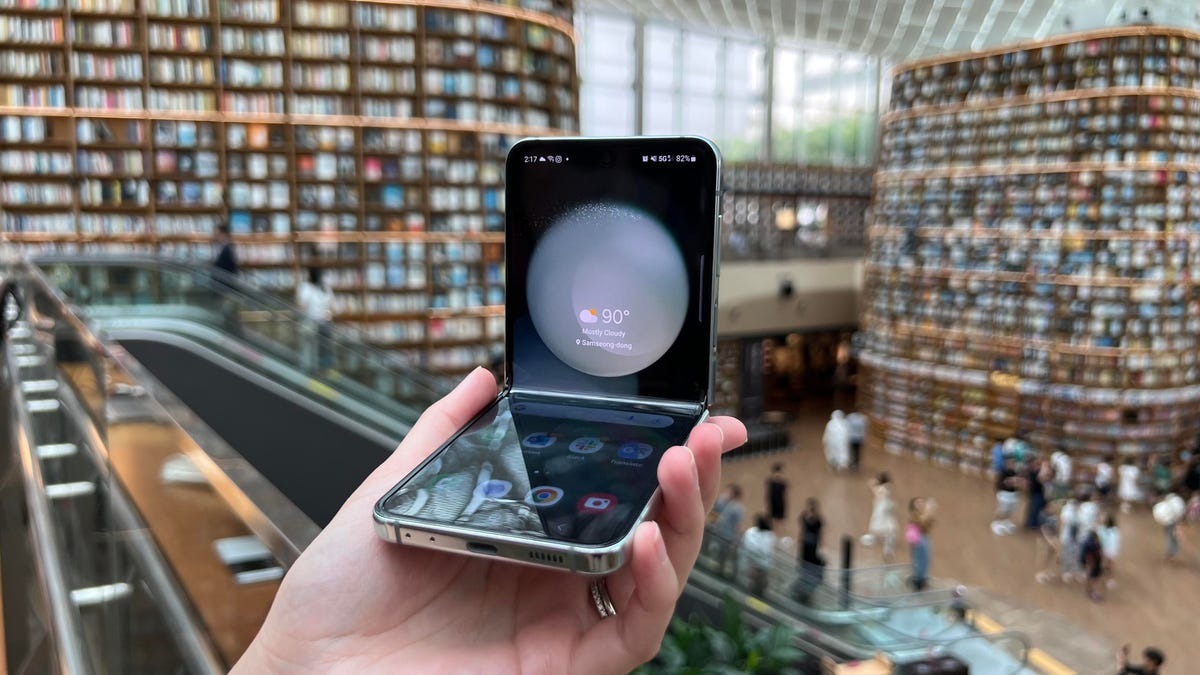
Let’s talk about his front-screen business. The Flip 5 features a much larger screen than its predecessors. These previous models only had a 1.1” screen to basically show you notifications, and that was it. Now you can fully use apps and replay messages on the front screen. This may seem silly to some, but it’s pretty nice and easy to use, and I use this feature a lot. Having a much smaller device in your hand to just do something as simple as check the weather, respond to a text, read an email, etc. is really nice. Samsung hasn’t fully enabled this feature yet. You need to enable apps through the Design Labs, but this in turn only allows apps that seem to be fully tested by Samsung. The Good Lock app on the Samsung store can add a launcher to allow you to open any app on the front screen, pretty much without issues. The apps resize down correctly, and some apps even have widgets that support the front screen already. With this being the first generation of the Flip with a full cover screen, it may take time for apps to natively support it.
Battery life seems to be okay, but the OS takes about a week to learn your habits and adjust how the battery is used accordingly. The 3,700mAh battery is just fine, but don’t expect 24 hours of use out of this. I got better life out of my iPhone 14 Pro Max, but improvements with use are still to be determined. The camera is pretty good but does not use Samsung’s flagship sensor that’s seen in the S series. The camera is a 12 MP sensor with a 12 MP wide telephoto lens. The front camera is a 10 MP sensor. They aren’t anything to write home about, but they aren’t awful either. I’m not a camera snob, so they work just fine for me, but if you want a top-end camera in your phone, this isn’t the one for you.


Super, thank you