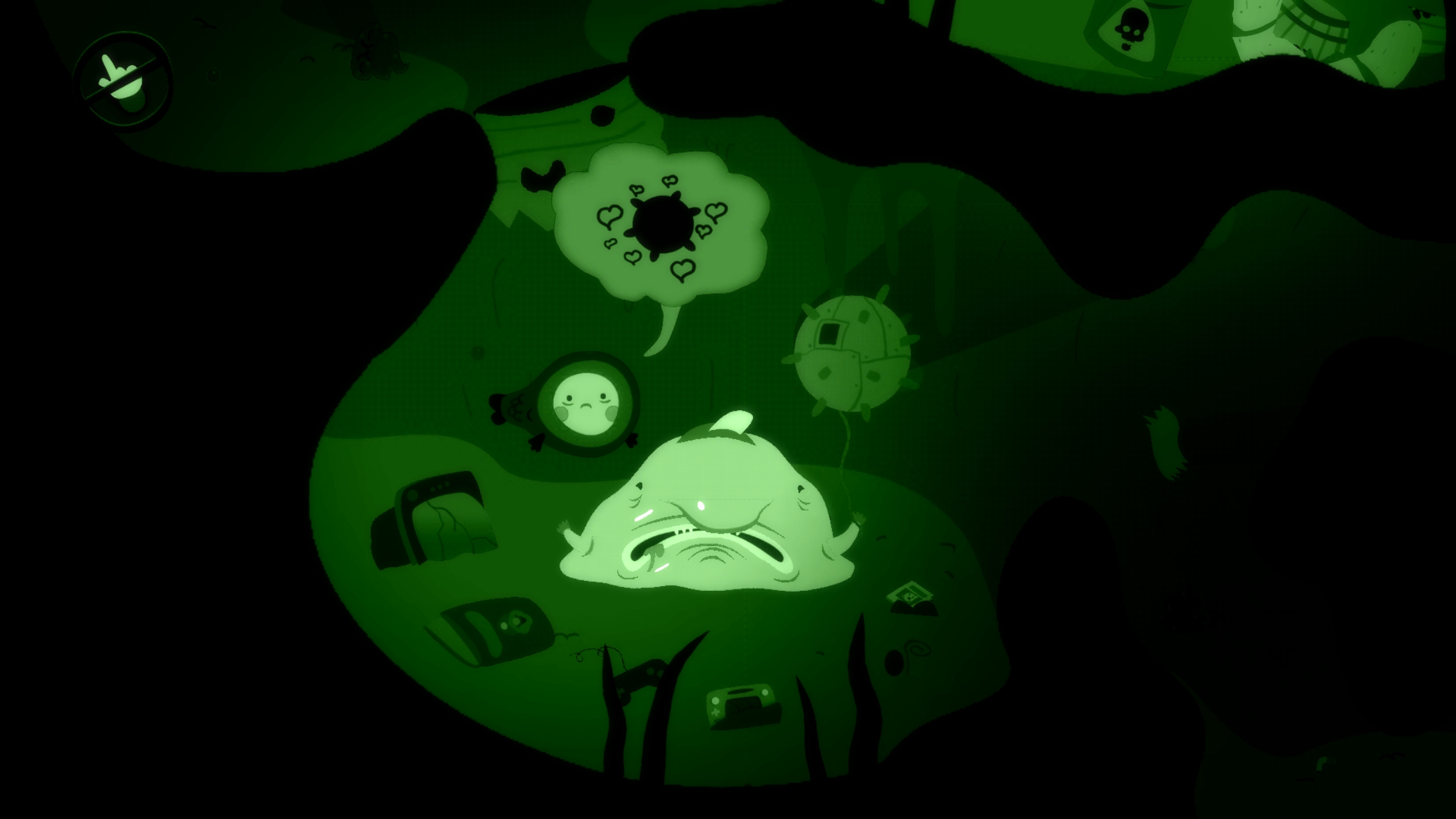
Adventure games are always hit or miss, as they have many classics to live up to. There are the occasional crazy and interesting adventure games like Neverending Nightmares that are quite fascinating. Bulb Boy is one such game where you play as a, well, bulb boy who must defeat a monster to save his grandfather. There’s not much of a story here, as it’s all about atmosphere and visuals. The game is rather short, and it’s not the most cerebral adventure game out there, but it’s worth a purchase.
Like in a typical adventure game, you can tap on areas for the character to move to and examine items. Bulb Boy is very straight-to-the point so there’s not much exploring here. There’s only so much to click on and very little inventory. The game has bosses on each stage that you must defeat, but the puzzles are very easy and not really puzzles. You find an object, and it can only go in one direction, as there’s no backtracking or exploring involved. I would love to see this universe expand, as Bulb Boy is grotesque, beautiful, and full of atmosphere. It’s a horror adventure with a cartoon flair, guts, and everything disgusting all over the screen.
There’s a lot of green in this game, and the cut-out art style is just fantastic. I enjoyed playing through the whole game, despite only taking a couple of hours. Bulb Boy’s death animations are brutal, there’s a lot of variety, and the game has a nice, quick pace to it. Some of my favorite things about this game are the extreme closeups of areas, as they show the sickly detail of everything around this character. It’s nightmarish for sure and definitely one of the most artistic games this year.
It’s a crying shame that this is an indie game and won’t get much attention. I hope for a sequel that’s more expanded, but we’ll see. In the meantime, just feast your eyes on the beautiful art, despite how straightforward and simple the gameplay is.
I reviewed both the S-View case and LED wallet case, and both offered something unique, but neither really was something to write home about. With the third, and final, official Samsung case for the Note7, we will see if this is your best bet.
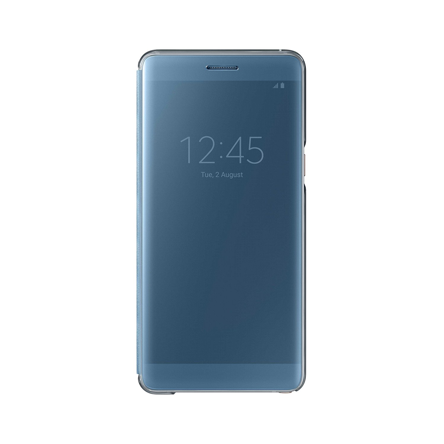
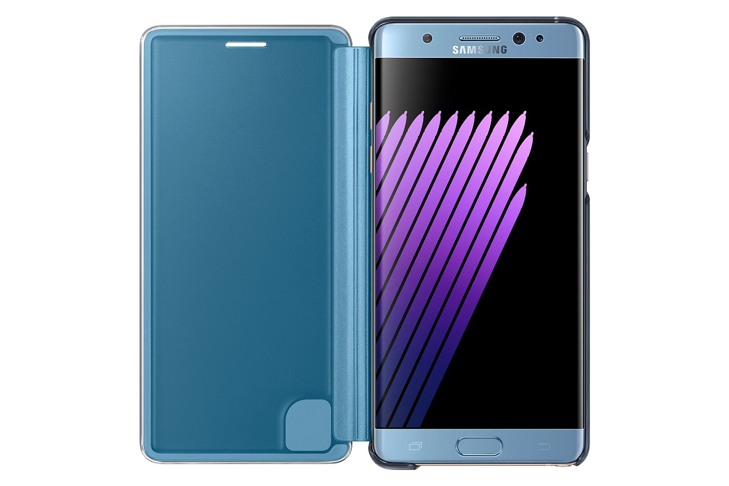
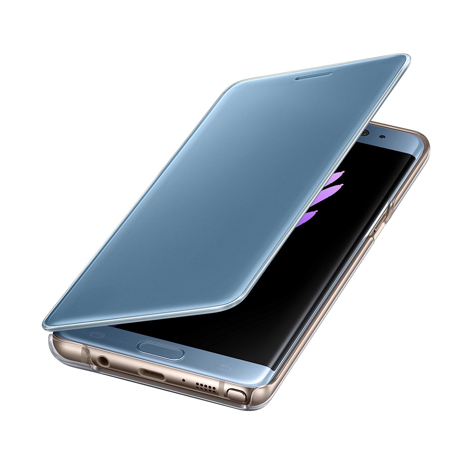
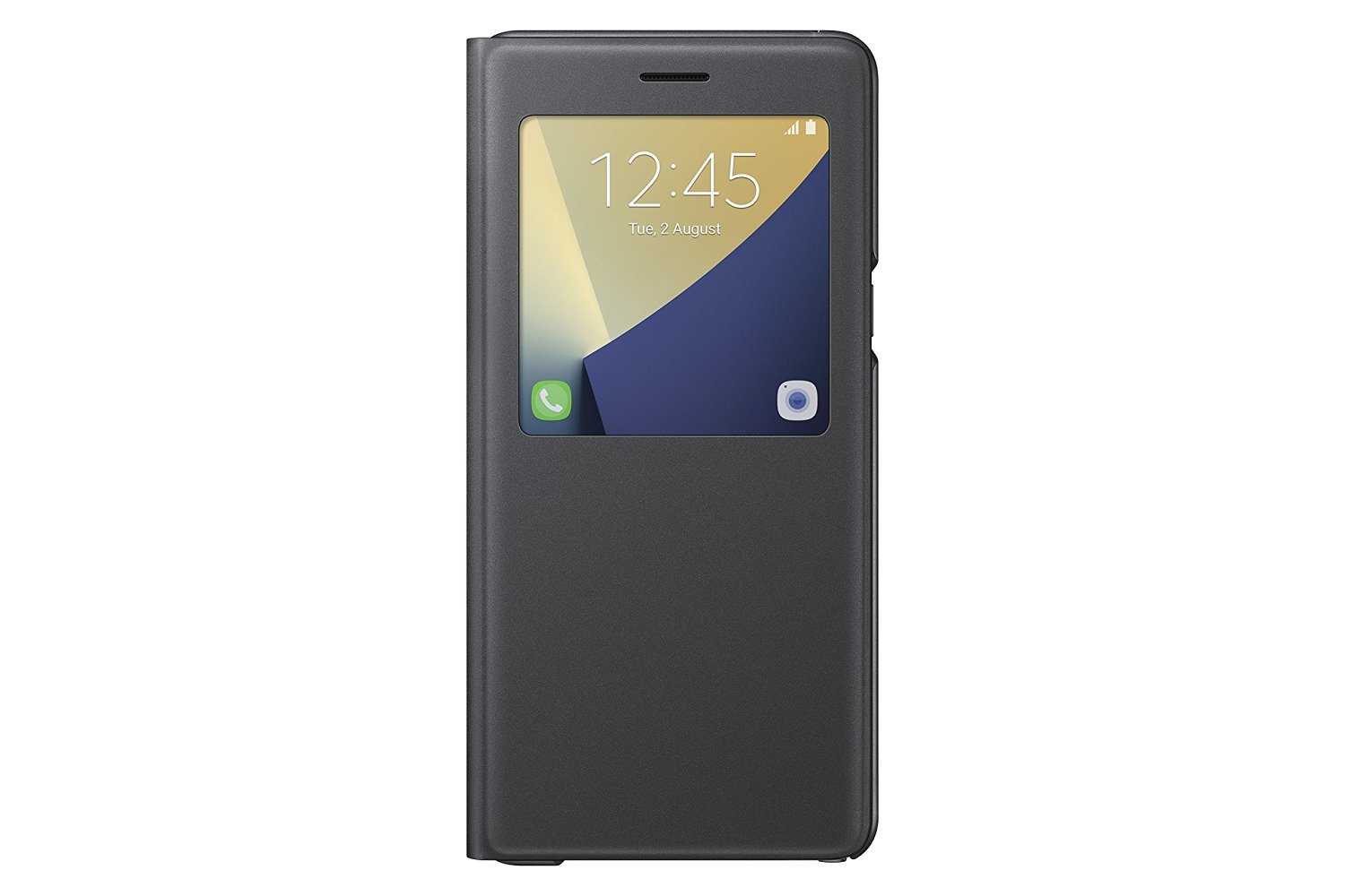
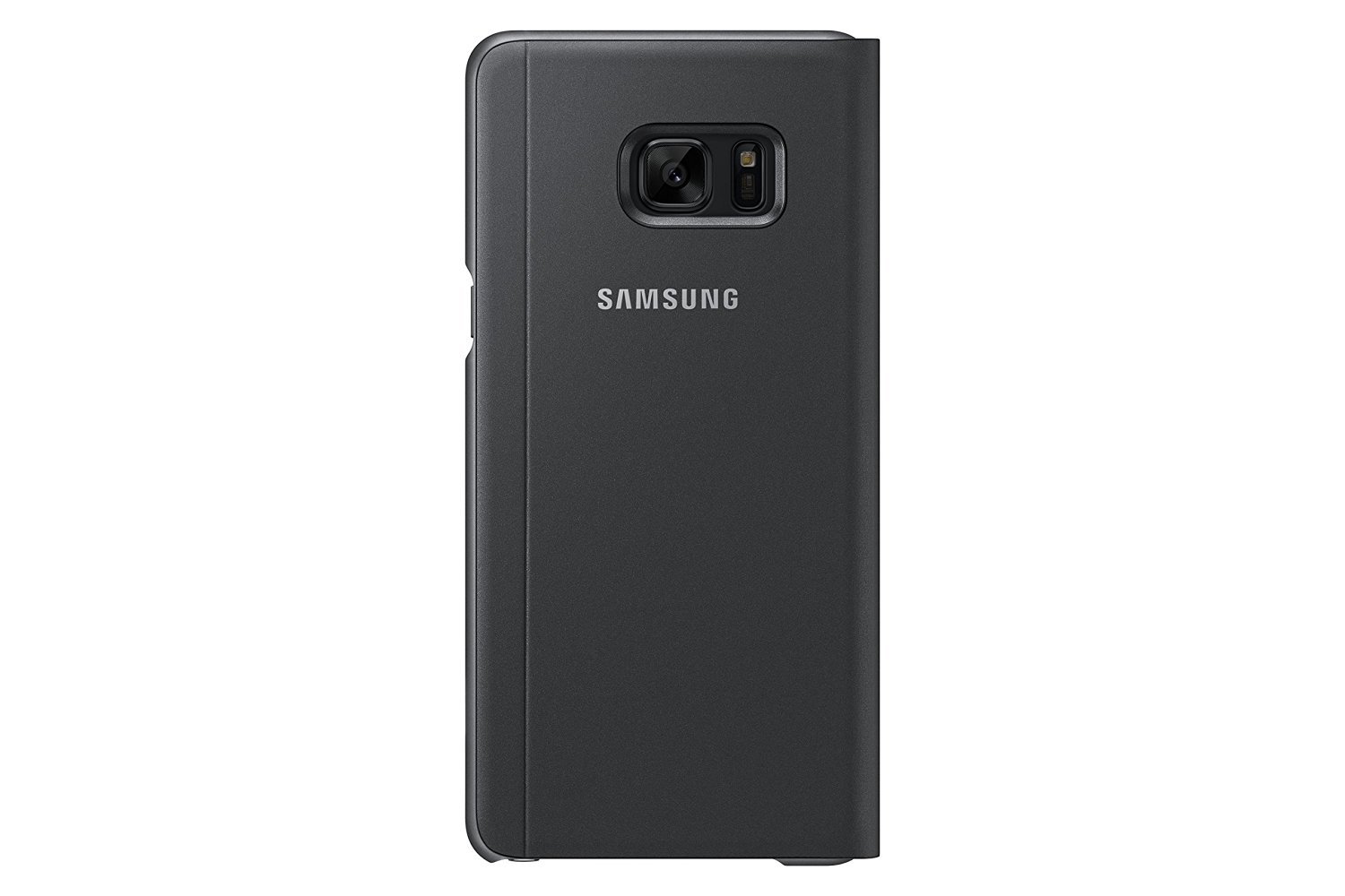
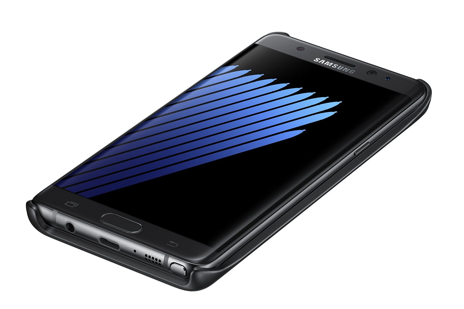
I actually opted to order online this time instead of inside T-Mobile, so I got the same color case as my phone, Coral Blue, and mad does it make a difference? Just being able to match your phone color really shows how great a case can look. The Clear View case is kind of the other two cases combined into one. It’s hard plastic all the way around, so it does provide better protection than the other two, and its door is heavier, so it stays closed more often. It fits firmly around the phone and has transparent edges, like the LED wallet, which looks great.
The front cover is translucent, allowing you to use the always-off display and a full-screen view. You can control calls, see incoming messages, and more with this case, so it’s fully functional. The only downside is that you can use the actual phone with the cover closed, and you have to still open it to see messages in apps, but this is kind of expected. Most standard features use the always-on display, such as phone calls. Most of the screen is black, with only the buttons lit, saving battery power. The case also feels slick and smooth and looks fantastic on my phone.
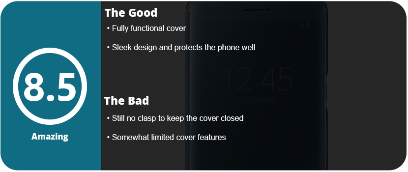
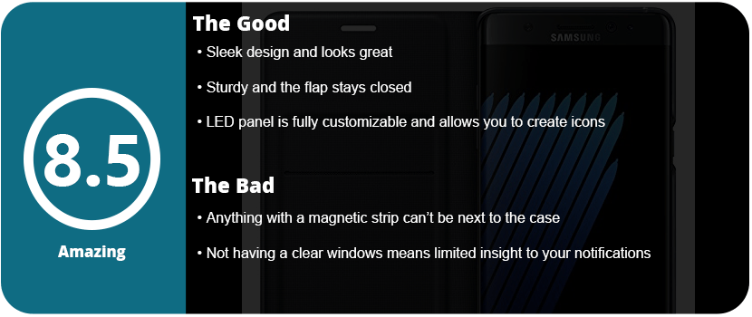
What keeps this case from being perfect is the lack of a clasp to keep that damn front cover closed. This won’t protect your phone if it falls face-first with the cover open, so it’s a gamble. As it is, though, it’s the best case of the three, and this is the one I recommend the most as it’s fully functional, provides better protection, and just looks better.
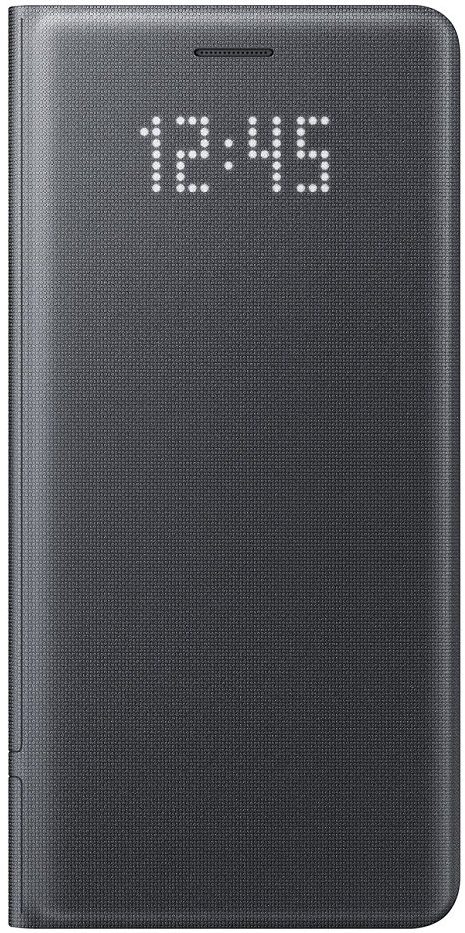
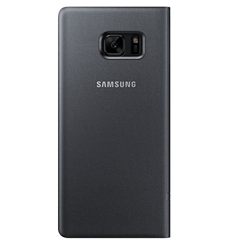
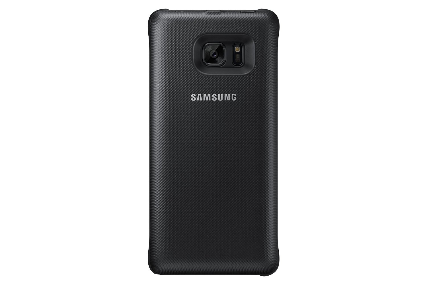
I recently reviewed the S-View case for the Note 7, and it didn’t turn out too well. I then turned to the LED wallet case, as it looked more sturdy and had a unique LED grid on the front cover that no other case I have seen has. What’s awesome about this case is that the LED functionality isn’t battery-powered, but it uses the NFC on your phone to run and takes less than 1% of the battery per hour to operate.
Samsung didn’t stop there, as there are software features that tie into this LED cover. For starters, the case itself is sleeker and better-looking than the S-View cover. It has a nice fabric feel to it, and the sides around the edge of the phone are transparent, so you can see the beautiful edge of your phone (especially the coral blue). The flap of the case has more weight to it, so it doesn’t just pop open even when laying flat, which is what mainly sold me on this case. It feels more sturdy, and a drop should survive in this thing.
Software-wise, the case allows you to see the time on the front as well as notification pictures. These LED (or 8-bit) pictures can be set to certain contacts, or you can draw your own with the S-Pen. Yes, this was a wonderful feature that tied other features of the phone into the case, which was great. Lastly, you can set icons for each and every app you have, which is very convenient. Now, unlike the S-View, you can’t directly see who’s calling or what the notification is. The LED panel is touch-sensitive, so you can swipe to answer or reject calls, and you can talk with the cover closed. These minor gripes don’t really concern me, as I knew what I was getting into when buying the case: There’s no window. You also can’t put credit cards in this wallet, as the magnet will wipe your strip. All you can put in are punch cards, driver’s licenses, and club cards that don’t have magnetic strips. That’s no big deal to me, as I like carrying my wallet and don’t plan to use this pocket anytime soon.
Overall, the LED wallet is so awesome that it turns heads and looks stylish and unique at the same time while protecting your large investment. I am planning on eventually picking up Samsung’s third case, the Clear View, to see which of the three is the best.
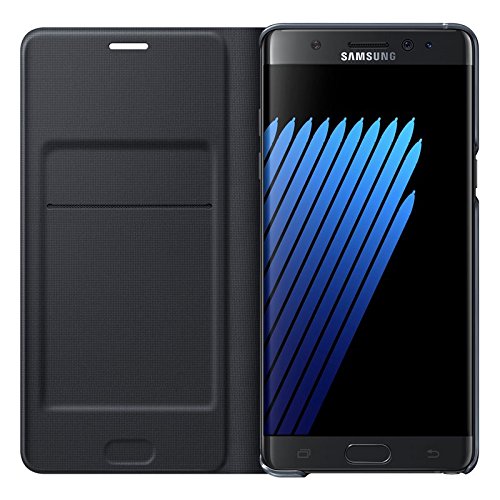
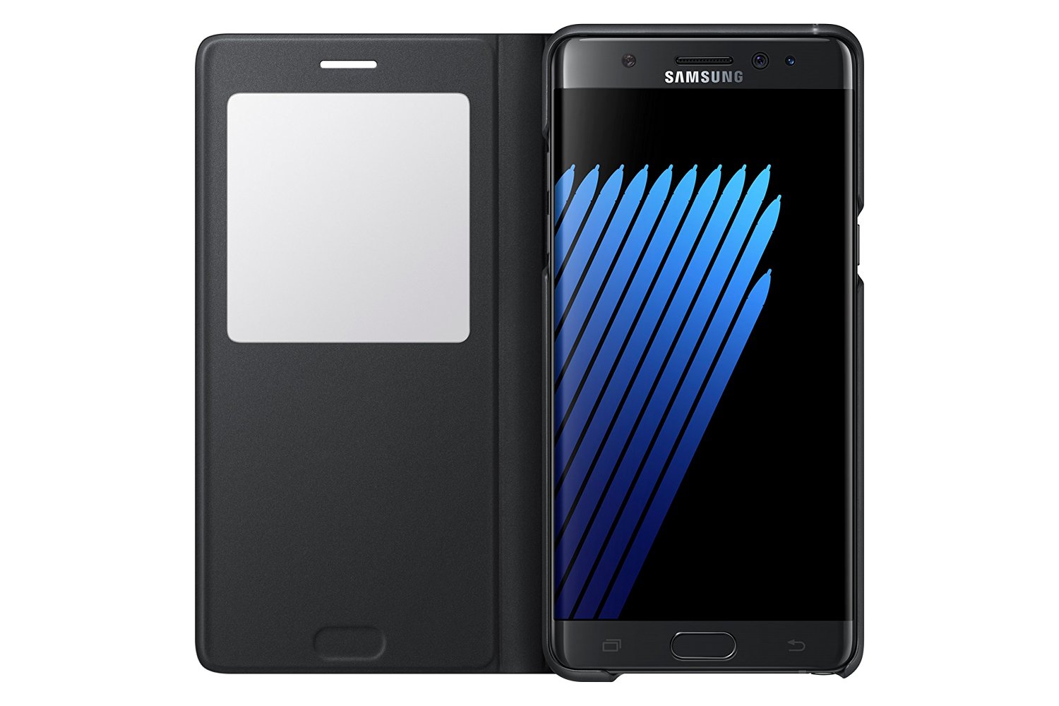
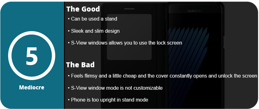
Official cases by phone manufacturers are sometimes the best bet, and Samsung always pushes the bar when it comes to accessories. They may be pricey, but they offer unique experiences you can’t get from third parties. Samsung has had a line of unique cases for some time, and the S-View cover makes a comeback with the Note 7. The case is new and improved over previous versions, but it’s still not quite the perfect case.
The case has a hardback that the phone snaps into and translucent edges that protect the aluminum sides of the phone. Right off the bat, I didn’t quite like this, as you can’t see the color of the phone inside as the edges are nearly black, blocking out the color. This won’t be a big deal to some, but I love the look of the rose gold edges on my coral blue Note 7, and it’s a must. The material is nice and feels good in your hand, but when you flip the cover over, that’s when things go downhill.
There isn’t a magnetic clasp or any way to keep the cover from flapping open constantly, and it feels cheap. The window is just a square piece of plastic, and after so many months, it could easily be scratched up to the point of not being able to see through it. The volume buttons were nicely labeled on the spine, and they pressed easily enough; however, the case just didn’t feel solid enough.
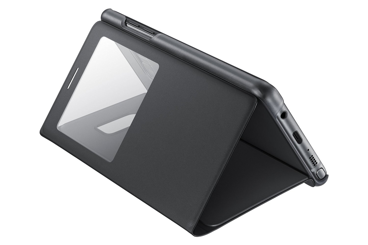
I did some drop tests on it, and it did protect the phone, but if it lands just right and that front flap opens, the screen is shattered. It felt like it wouldn’t protect the phone and was kind of flimsy. The actual use of the S-View window is nice, as you can access everything you normally would on your lock screen, but you must open the cover to actually see the apps, which was a bit annoying. You also can’t customize what’s seen on the window with just two icons you can switch out.
Overall, the S-View cover can’t only be recommended to people who don’t really worry about protecting their phone or already like the S-View cover. I returned this to T-Mobile and got the LED wallet cover instead, which is much better. If there was some way to keep that flap closed, I could see this being better. The only upside is that you can use the phone as a stand, but I felt the phone was too upright and was only ideal when laying down.
Lifeline was a fantastic text adventure game that delivered a memorable atmosphere, character, and story. It was the first of its kind—an actual texting adventure. Taylor, the main character, would describe his settings and actions, and you had two choices you could respond to. Some actually changed the course of the story for the better or worse. Silent Night is the sequel toLifeline 1, with Taylor being rescued by a mining ship, but more disasters with the Occupiers continue.
Silent Night is disappointing in the sense that it doesn’t bring about the loneliness and desolate atmosphere that made the first game so great and memorable. Silent Night has a cheesy sci-fi Alien-type feeling to it, with generic crew members and a claustrophobic ship. I also hate Taylor’s cheesy sense of humor, as it’s in the wrong place at the wrong time and is overdone. A tense scene is broken down by a stupid one-liner or pop culture reference, and I absolutely hate that. Humor has its place, but every other line? I don’t think so.
If the humor wasn’t badly written, the game is so short you can finish it within a couple of hours. What made the first game so awesome was actually waiting in real-time for Taylor to respond. I feel this is sped up too much, and the choices aren’t as varied or branching as in the first game. I got the perfect ending without even really trying, and that’s not a good thing. In the first game, I rewrote the story just to see the different outcomes.
With that said, this is the end of the line for Taylor, but there are spin-offs and prequels bound to come, which I will welcome. Silent Night is probably the worst game in the series so far, but it’s still worth a play for hardcore fans.
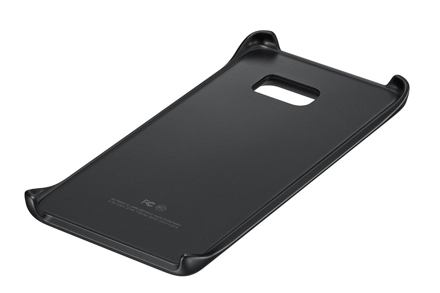
I love the wireless charging features of the new Galaxy phones, but you’re still tethered to a cable at work, in the car, or on the go. Samsung finally thought about bringing about a wireless charging snap-on cover to keep your cord-free. The cover looks sleek, is ultra-light, and complements the design of the Note 7, but it’s not perfect and almost not worth a purchase.
The battery pack itself is perfect design-wise, but for practical use, it’s for emergencies only. It says right on the packaging that it doesn’t charge the phone all the way but “about 1/2 charge,” meaning 40–50%, which is fine. It does support a pass-through charge, meaning the cover will charge your phone and then charge itself if you have the cover plugged in. The other big issue is that this isn’t fast charging. It takes about 1 hour to charge the phone 50%, and if you use the phone, you’re lucky if you get a 35–40% charge. This also isn’t a huge issue, as you can snap the cover on when it’s 100% and keep it there for a couple of hours. I honestly only see this as useful if your phone actually died or is within 30% of dying and you’re away from a charger.
If this cover was fast charging, I could forgive it a lot more, but for the asking price, this is very hard to recommend. I love the convenience, but it’s got a smaller battery than the Note 7 itself. If you find yourself always killing your phone when you’re out or you take long trips, this is for you, as it doesn’t take up much room. If you can always access a charger, then skip this entirely.
Well, here we are, six years after getting my first Android phone, and the Android environment has grown and changed faster than any other technology I can think of. In the early days of Android, it was obviously trumped by iOS, and rightly so. The operating system didn’t’ do much; it was extremely buggy, very ugly, and not streamlined at all. I remember the early days before Google Play was the Android Store, and it was full of awful apps that either crashed your phone or were spam, and there was no organization whatsoever. Not a single major developer wanted their app in this untrusted “iOS clone,” but I stuck by. It wasn’t just the operating system that was unable to keep up with user demands, but the hardware. Apple perfected its hardware and software with the iPhone 3S, and it hasn’t changed much since. Motorola was one of the best headliners for Android, but their phones were awful and slow, and the custom Android ROM was terribly designed. Trust me, I owned the original Droid and Bionic—the worst phones I have ever had.
I then switched to Samsung with the release of the Galaxy S4. The issue with Android phones back then was that the manufacturers would master the current OS version and then create the phone around that. Once the new OS was released, the phones were slow, buggy, and unusable. My S4 turned into an overheating paperweight, and I hated it. With the Note 4, it was a little faster and more streamlined with KitKat, but once Lollipop was released, it ruined the entire phone. It became slow, buggy, and also unusable. It wasn’t until the Note5 that Samsung perfected its hardware and got a strong grasp on Android. Google even stopped adding features and released Lollipop as mostly a speed and battery upgrade, and it did wonders.
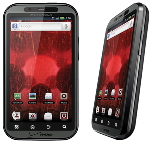
Motorola Droid Bionic. One of the first phones to have a dual-core CPU and 4G LTE. Hated it right out of the box.
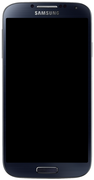
Samsung Galaxy S4. The first step in getting Android phones right, but all the gimmicks drained the battery.
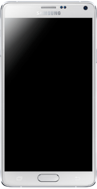
Samsung Galaxy Note 4. A great step in perfecting the phablet, but future Android versions ruined this phone.
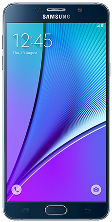
Samsung Galaxy Note 5. Nearly perfected. Future updates just made the phone better.
The Looks
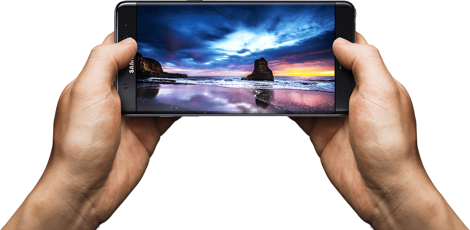
So, here we are in 2016 with a brand new set of Android phones. It’s no longer about being bigger and solely relying on who has the highest screen resolution and best camera. These things are all standard and easy to come by, even on budget devices. Samsung is pushing the envelope with its design. That’s right, we’re over new hardware features so much now that we can worry about how a phone looks. When you whip out a phone, you get judged as much as the car you drive these days. The Note5 was one of the sleekest phones ever released, and the Note7 trumps that. It takes the basic body design of the Note5, slims it down a tad, and adds a curved display. It may not seem like much, but it’s so much more enjoyable to view a curved screen. It creates a much more immersive experience, and it’s easier on the eyes. It’s a true edge-to-edge display and looks better than Samsung’s other flagship S series. The new glass and aluminum body that was carried over from the Note5 is perfected in every single way.
Hardware – External
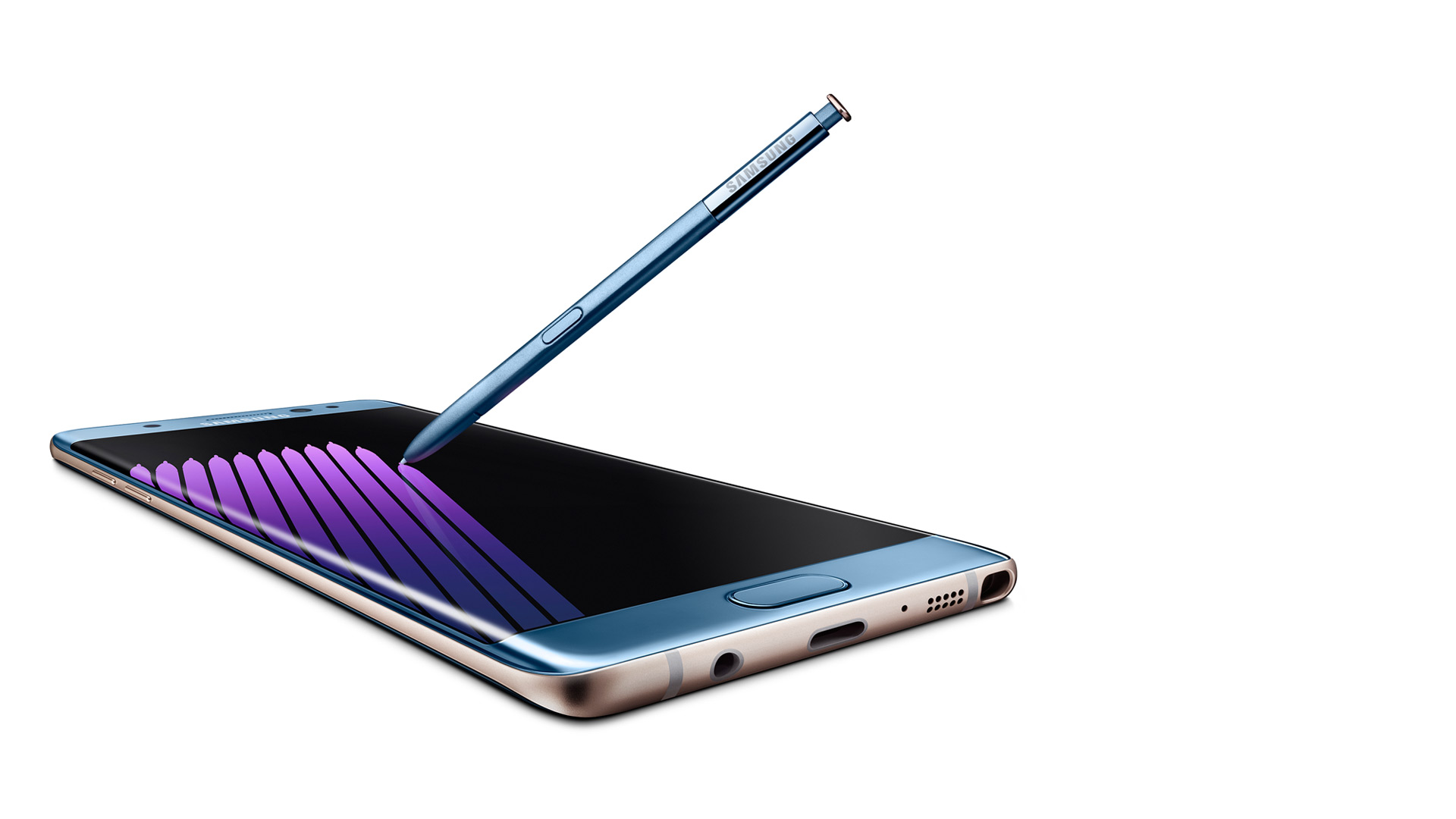
Outside of the sleek look and colors (which look gorgeous, especially Coral Blue), you will start to notice the actual hardware design features. There are additional round circles at the top, which are the new iris scanner and the physical home button, which have been perfected. Yes, I’m bragging about the home button, which has been a Samsung staple since the first Android smartphone. It’s not a solid piece that clicks down, but it’s softer and rocks with your finger. You can roll your thumb over it, and it forms on your thumb, so it’s a smooth press. It also no longer clicks but just presses and feels “mushy,” which is a good thing. So one thing has been perfected so far.
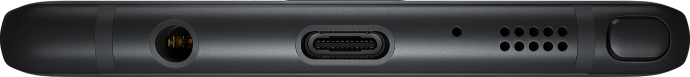
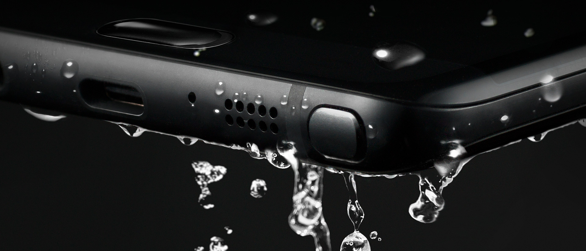
Next, you will notice the usual bottom stuff like the 3.5mm headphone jack, speaker, mic, and S-Pen. This is the same S-Pen used in the Note 5, but more on that later. On the top are your SIM card and microSD card carriage (yes, it’s returned!). and the side features the same power button and separated volume buttons (not a rocker) like the Note5. So, as for the outside of the phone, it’s perfect, and everything fits in your hand just right. Oh yeah, and this phone is water-resistant, meaning you can submerge the phone and it won’t get ruined. It’s not waterproof, as you can’t go a certain depth or have it wet for too long, but a quick dip in a toilet won’t hurt this baby a bit.
Getting Started
As for the setup experience, Samsung has gotten this down pat and it was even easier than with my Note5 last year. Samsung’s new Smart Switch app allows you to plug in a cable to each phone (an OTG adapter is included) and allows you to select what you want to transfer. Files, photos, documents, videos, and apps. You can also select each individual file if it’s to your liking. The downside is that it’s a slow transfer, and impatient people who are excited to mess around with their new phone may bypass this. I chose just a few apps, and it still took 15 minutes to transfer everything. It’s still a great feature and puts your mind at ease about whether you backed everything up or not.
Once the phone was set up and everything transferred, I started to notice how beautiful this screen is. Being QHD (2560×1440) and curved is just mesmerizing. This is the most beautiful smartphone screen I have ever seen. Everything is bright, crisp, and just so true to its real colors. Before I talk about more software features, though, let’s see what’s under the hood.
Hardware — Internal
For the first time in a while, Samsung ditched their own Exonys chipset for a Snapdragon 820 (for North America anyway). It’s a huge difference, as Samsung’s chipsets aren’t really the best, and Snapdragon already has very fast and reliable chipsets. The CPU may have fewer cores and lower clock speeds, but it’s more streamlined, which makes it faster on the software side. The Snapdragon 820 sports 4 cores: 2 running at 2.15 GHz and 2 running at 1.59 GHz. Again, don’t let the low numbers make you think this phone is slow. The GPU is the Adreno 530, which is the latest and greatest for gaming. It sports a whopping 624 MHz clock speed for maximum gaming compared to the Note5’s Mali-T760, which ran at an even 600 MHz. I was able to notice games running at 60 fps, which were done through the software as it was streamlined enough to allow this. Samsung has a great gaming suite (discussed later).
The phone also has Bluetooth 4.1, the latest cellular bands and WiFi, 64GB of internal ROM across the board, and 4GB of LPDDR4 RAM, which is lightning fast and plenty for all your apps. The phone features a snapper from Sony again, which is the new Sony Exmor R IM260, but Samsung’s own front camera, which is their ISOCELL camera, This is the first phone that actually records video in 720p at 240 fps, which looks phenomenal on the screen. If you thought 60FPS at 1080p was amazing (which is standard now), 240FPS is something else.
Write Like a Pro
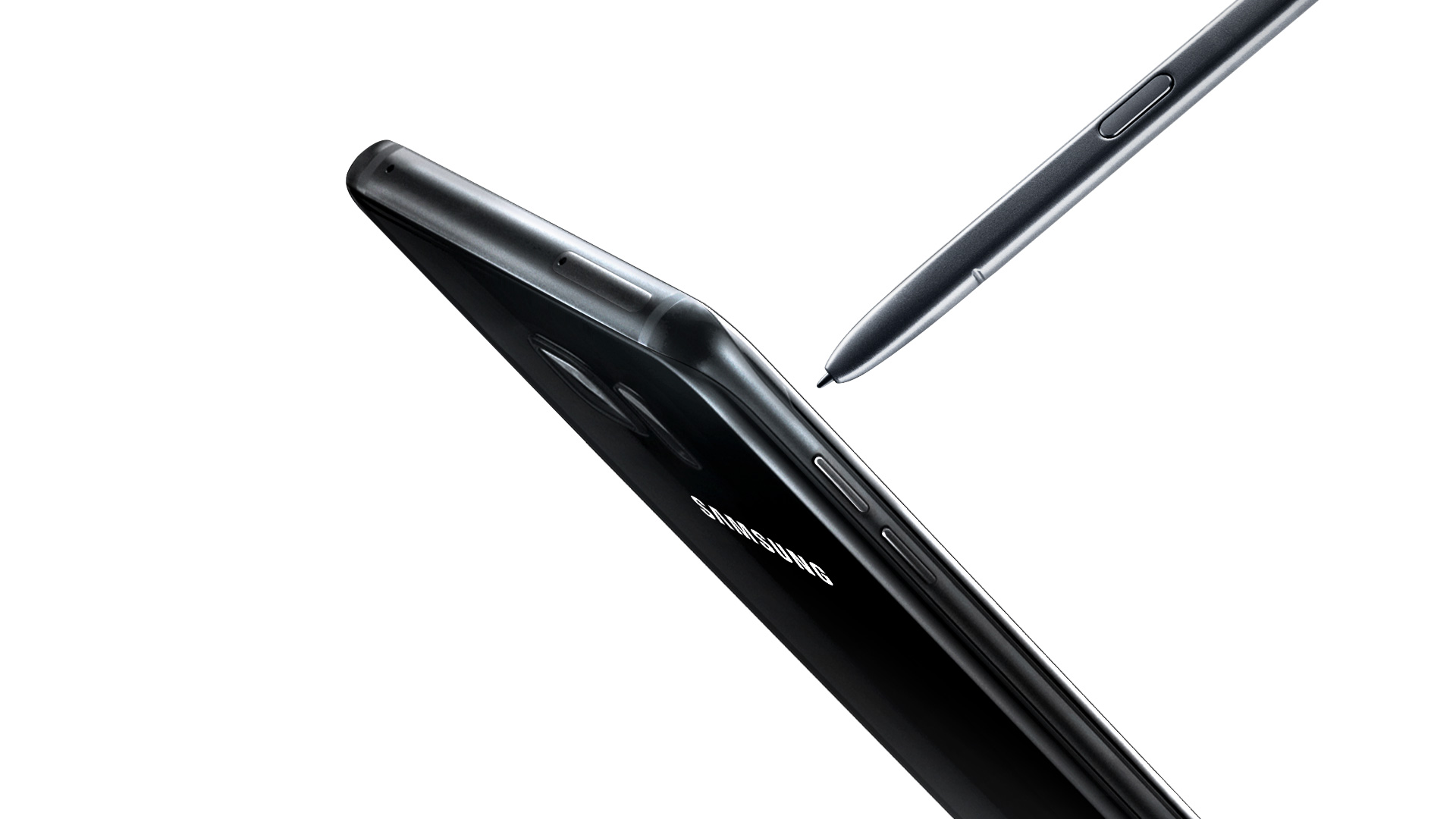
With that said, let’s get to the S-Pen. It’s not just a copied Note 5 pen with a new color. It looks slightly smaller, and the button is located higher on the pen, like the Note 5. It also has a much finer tip, and this is due to the pressure points being bumped up from 2,056 to 4,096, which is double the sensitivity rate. There’s a huge difference in the way it writes, as it feels like an actual pen on paper. There are also several new software features that make upgrading well worth it. For starters, the screen-off memo has been improved. The phone supports the always-on display, and the AMOLED screen allows the software to control each individual pixel to save battery power. The screen-off memo is now actually truly off, and the pixels turn on as you write, saving power. The Note5 just had a black screen that you wrote on, but the screen was always on.
There’s also a new GIF animation feature that is an upgrade for Smart Select. You can draw a square marquee around a video, record a short GIF, and then later edit it. This is exciting for people who want to send goofy things to their friends. The next brand new feature is the translate button, which allows you to hover over a word, and it will pop up with the translation and audio from Google. This works very fast, but I’d like to see the ability to do more than one word at a time.
Software
There are several other software features that make the Note 7 a perfected Android and Samsung phone. Samsung completely redid their TouchWiz custom ROM, and it looks fantastic. The new pull-down shade, menus, and overall look are gorgeous and complement the curved display and AMOLED screen. I personally don’t like any manufacturer home launchers, but those who hated TouchWiz should take another look. Second, the phone features several new settings, such as a blue light filter if your eyes hurt you when looking at the phone for too long, better WiFi calling, a fingerprint scanner (it’s more accurate), and more accurate smart screen features such as swiping for a screenshot, smart stay, and quick view. The new gaming suite is awesome, and I love it so much.
Gaming Taken Seriously
There are two new tools called Game Tools and Game Launcher. The Game Launcher is a streamlined app that shows all of your games, auto-detects everything (you haven’t had a game that it didn’t detect), and allows you to customize the power-saving features for that game. Already, most games run at 60FPS on the Note 7, but to save power, you can cut it down to 30FPS and even turn off various features of the phone. This is great for lower-end games like Clash of Clans that don’t need to run the phone at maximum capacity. The new Game Tools is a small little red icon (you can move it around) that opens up into a wheel that allows you to take a screenshot, record footage (with audio commentary), turn off notifications, lock the menu and back keys, and minimize the game into a small icon. All these features work smoothly and wonderfully, and I take full advantage of them all the time. I can now record my best hits in Golf Star or make some funny jokes while raiding a village in Clash of Clans and send them to my friends via a Dropbox link.
Biometrics of the Future
I’m saving the best for last; I haven’t forgotten about the iris scanner. Now, this thing works better than I originally thought. The fingerprint scanner in the Note 4 was awful, and I thought the first outing for a new biometric security feature would be the same. I’m dead wrong. The iris scanner works so well that I don’t quite understand how it works. I look at the top portion of the screen, and it just scans my eyes with some sort of night vision camera. Sometimes the iris scanner works faster than the phone can display what’s going on, which isn’t a bad thing. It’s neat, the first of its kind, and a whole new layer of technology. I had someone tell me that it just recognizes the shape of my eyes, but I used three people to unlock my phone, and they couldn’t do it. It can actually read your iris and won’t unlock it for anyone else. This is a wonderful technology, and I feel even more secure knowing that no one will be able to access my phone. Now we just need third-party apps to start implementing it into their software.
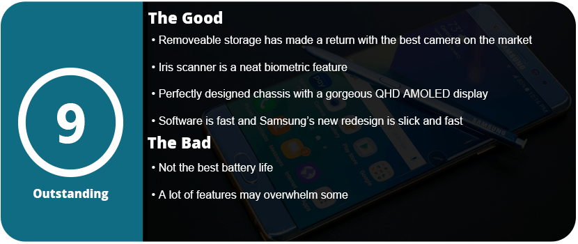
Overall, the Note 7 is a perfect phone. I mean, perfected to a T. I even had a hardcore Apple fanboy comment that Samsung has finally done it and created the perfect phone (he’s currently sweating out the long backorders). From the physical design to the software design, the Note 7 is the pinnacle of smartphone technology. With the return of the microSD card, water resistance, a larger battery, and overall better design, it’s just the perfect phone. It’s fast, powerful, secure, and gorgeous all at once. I know each phone iteration becomes more and more perfect, but the Note5 wasn’t quite perfect, but I can happily say the Note7 is.
Point-and-click adventures are becoming big on mobile platforms, which is nice. Sitting down and relaxing with a great story and exercising your brain with puzzles is a perfect fit for mobiles. Sinless is a strange game, as it doesn’t make any sense, but it is still enjoyable.
You play in a cyber-dystopian world where everyone is controlled via computer chips called “progs,” which have pre-programmed attitudes and moods. You just so happen to be someone who is immune to this control, and the government wants to kill you. You travel through a strange city trying to find your girlfriend and realize you are part of some prophecy and are some sort of messiah for this desolate world.
The strangest thing about the game is the art style. While it’s great and very stylized, it’s muddy and washed out and almost doesn’t quite work for this game. It’s very hard to see things in these images and find objects to click on. I really love the art, but I feel it’s not right for this type of game. With that said, it really gets the mood and atmosphere of being tense, controlled, and lonely; everyone is living in constant fear. My issues didn’t set in until about an hour into the game, when I realized there were no clues on what to do or where to go next. I had to resort to a walkthrough.
This is usually common in adventure games, but this is a 3-hour game at most. Yes, only three short chapters. There is so much backtracking and obscure conditions you have to meet to finish the game; it was just too damn confusing for me. I was really into everything but the way the game was played. I also didn’t like that the clickable dots only appeared if you left the screen alone for a while. With the washed-out visuals, I wanted them on screen at all times.
At least this game has some pretty cool mini-games that make you smile and appreciate it a bit more. There are also some video game references, such as Mirror’s Edge, which was nice to see. Overall, Sinless is worth the purchase price, but don’t expect much out of it after a 3-hour sitting.
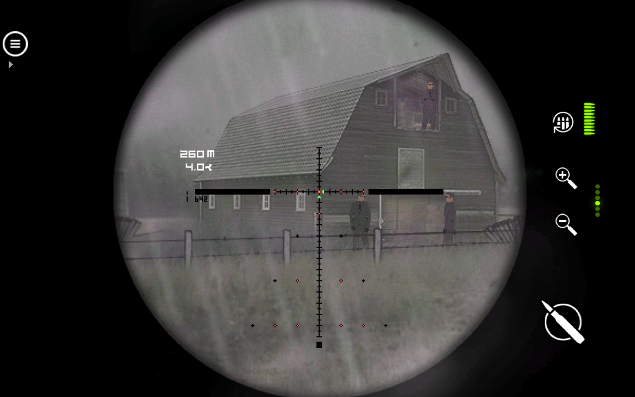
I’m not really a fan of these mobile sniper games, but Lonewolf caught my eye due to the art style and mature content. The game has a noir/mob gang comic vibe to it, and it is actually quite entertaining, albeit formulaic. You play as a military veteran who used to be a sniper and loves killing. You pick up work for a mob boss and stay neutral through the whole thing. Nothing to write home about, but enough to keep you pumping through levels.
The game is seen through the scope of a sniper rifle. There are plenty of rifles to pick from in the game that are real-world models. You can upgrade them and buy new parts for them, which is quite fun. There’s a zoom button, reload, and shoot—the only three you need in a game like this. Each mission is completely different, which is why I kept playing the game and didn’t want to put it down. After a while, there’s a wind aspect, and you need to lead your shots, which is a huge challenge and actually requires skill rather than luck. Each mission just has a few guys set up to kill, and it’s the order and precision that count. If you shoot the wrong one, someone might see it and blow the mission. There’s a lot of trial and error later on, and it got quite frustrating, especially during the few shoot-out scenes where your aim is really important as you die quickly.
This is also a freemium game, but you have the choice of buying it without ads. With ads, you have to watch videos to reload your retries, or you have to wait. With how hard the game is later on, it felt like this was done more for money than the player’s entertainment value, which is something that’s consistent in the mobile realm.
Overall, Lonewolf is well worth your time as it provides varied missions and relies on your skills to proceed rather than luck or something else. It’s well worth the purchase to remove ads, but if you have the patience, it’s also free.
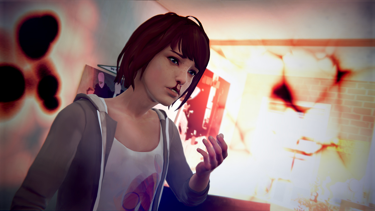
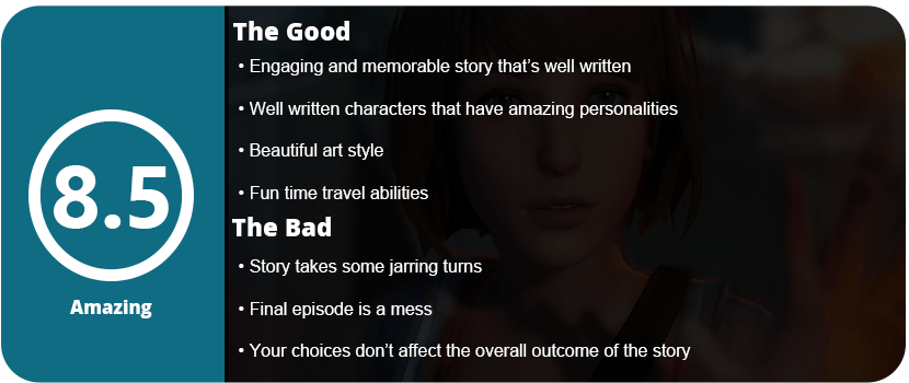
Have you ever wanted to time-travel and change the past? How about just the last 30 seconds? You get that option in Life is Strange. You play Maxine Caulfield, who discovers she can rewind time by saving her childhood friend from a fatal gunshot wound in the girl’s bathroom. This changes Max’s life and everyone around her, but it’s up to you to decide if it’s for good or worse. Life is Strange tells a fantastically beautiful story with wonderfully written characters. The game will keep you hooked and have you playing all 8 hours with barely a blink.
Life is Strange tries to build on the revolutionary point-and-click adventure genre that The Walking Dead revived from Telltale Games. The game is a little more open-ended, but not by much. There’s more to explore and items to “look at,” which gives you a bigger insight into Max’s own thoughts and mind. Honestly, by looking at all these objects, you get to know Max better and the world around you more. Besides this, you just walk through every area to the next character that advances the story. There are some “time puzzles” that require you to select certain dialog choices and then rewind time to use that information to your advantage. It’s an interesting idea, but Life is Strange’s storytelling is a bit of a mess and requires you to pay attention very closely or you will miss something.
The game is broken up into 5 episodes, and each one has a cliffhanger ending. The game goes on at a good pace except for the final chapter, which is a roller coaster and kind of a mess. Without spoiling everything, you kind of “review” everything you have done through the game, which involves an awful stealth sequence. However, through the entire game, I couldn’t help but realize that no matter what I chose, the final outcome never changes, which is odd. It’s not until the last two chapters that all your choices start to unfold, but I feel they are just detours rather than different outcomes. Despite that frustration, the story in Life is Strange is amazing.
I have to talk about the atmosphere of this game. It’s so nostalgic and really reminded me of my adventures as a kid growing up, and it really makes you think about your family, friends, and what’s going on around you in your life. That small country life is something I grew up with personally, and the game really hit home with me. It sucked me in every minute, despite the slow start I had to push through. The entire game is so touching and full of emotion; it’s one of the best video game stories I have ever seen, but it still doesn’t top Soma. This is a story you will talk about long after the game is over and ponder over. The only thing that really annoyed me about the story is that it tries to turn this innocent teen drama “Where did my best friend go?” mystery into a serious murder mystery, which is kind of jarring. I loved exploring these areas out in the middle of nowhere and getting into shenanigans with Max and her best friend Cloe through their time travel events. Once the murder mystery stuff hit, it was a bit of a turn-off, but it wasn’t until towards the end.
Life is Strange also isn’t the prettiest game to look at; it’s rather ugly. The game has a nice watercolor art style, but the game’s technical level is a first-generation Xbox 360 game at best. The textures are muddy and awful, and the character models are terrible. This is just a downright ugly game, but the story and characters keep your head out of that. Overall, this is worth every dime and all your time invested.


Try multiplayer. A lot of fun !